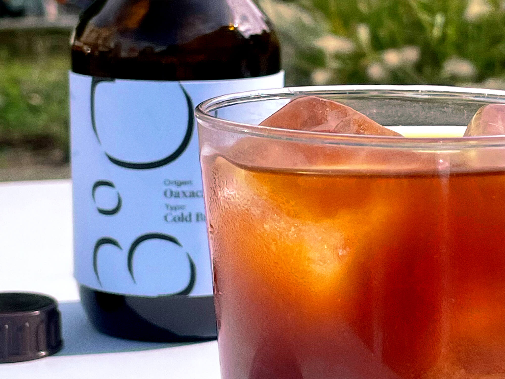
Boiling water at 93°C hits the perfect temperature for brewing espresso. Applying the right pressure ensures you've crafted the ideal espresso. With this in mind, I started designing the packaging for this third-wave coffee brand. As I got into the project, I discovered more connections between coffee and climate beyond just temperature.
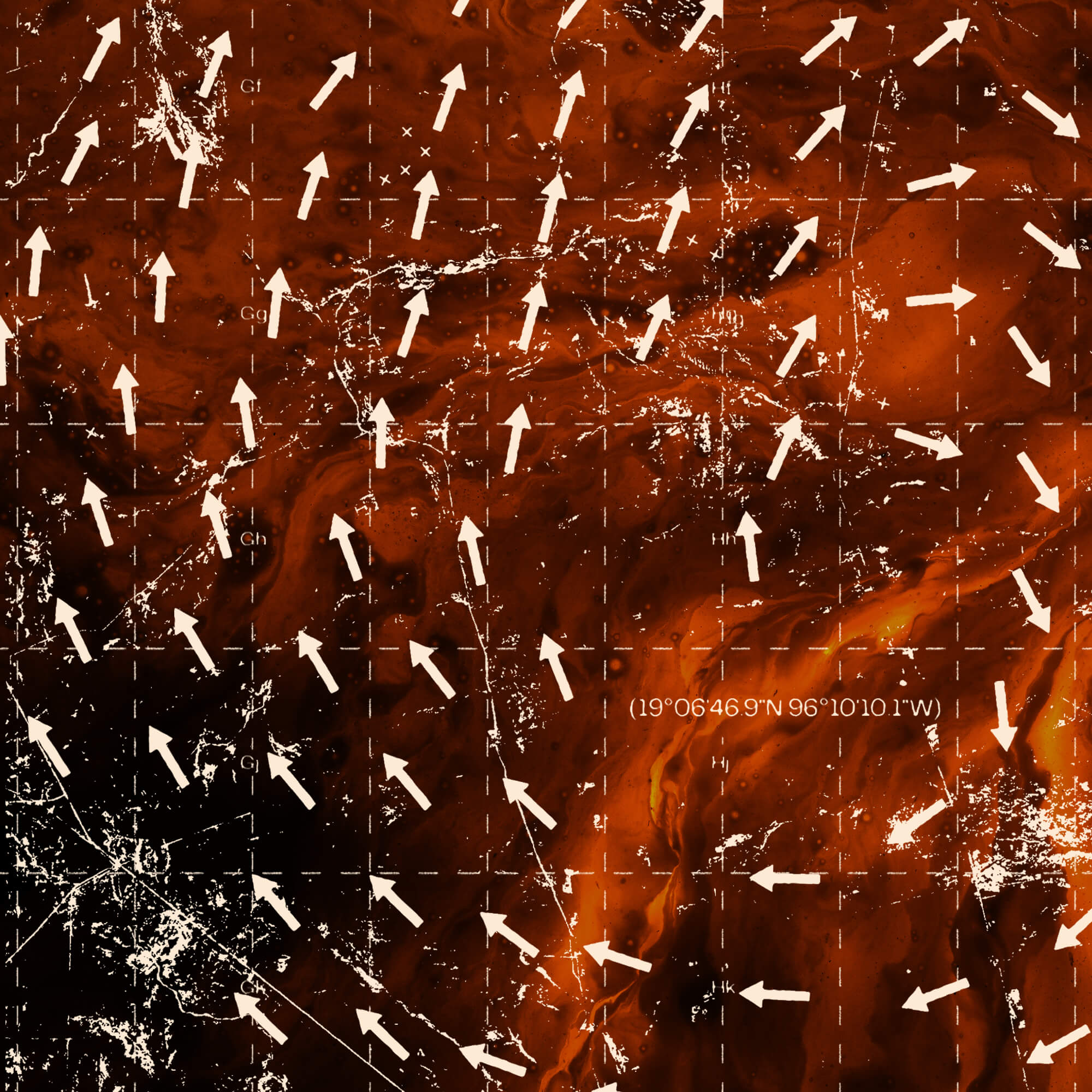
I looked into weather maps and found the iconography of pressure areas intriguing, especially the use of right-circling arrows for high pressure and left-circling arrows for low pressure. These elements caught my interest because espresso requires high pressure, while cold brew needs none.
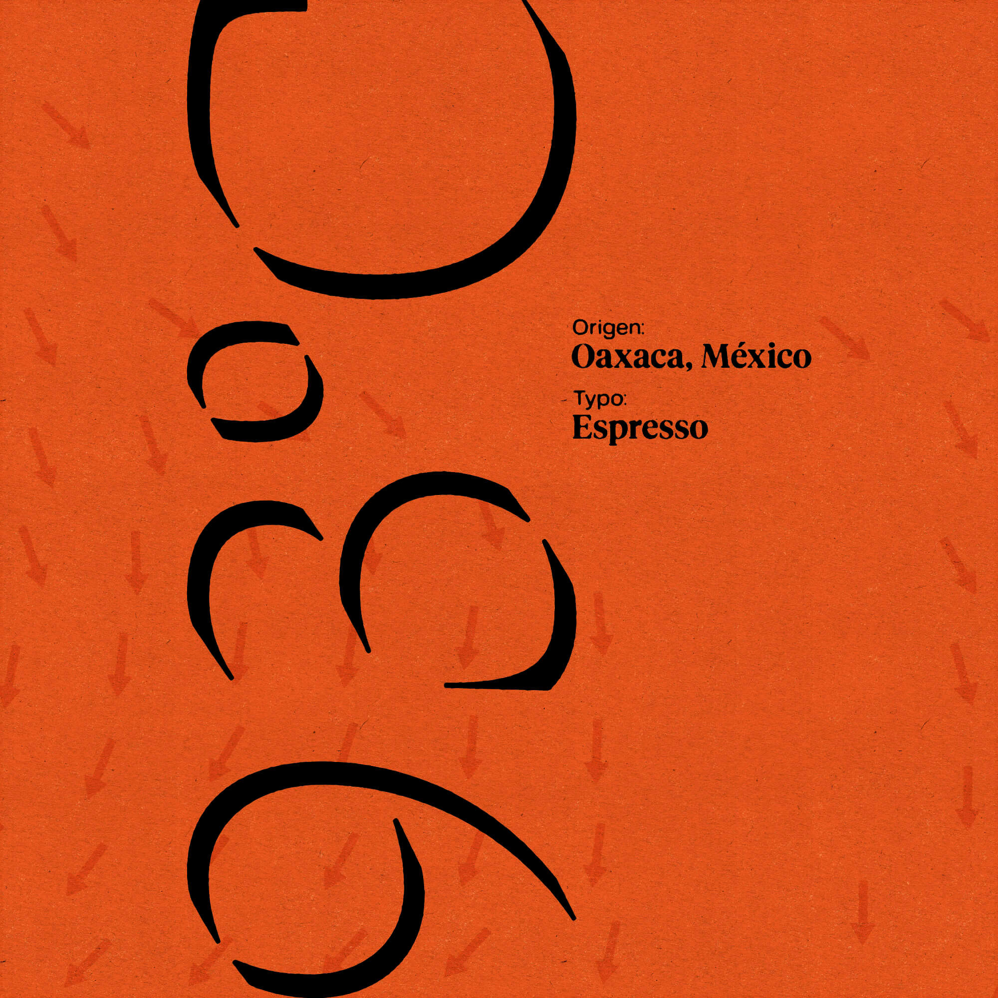
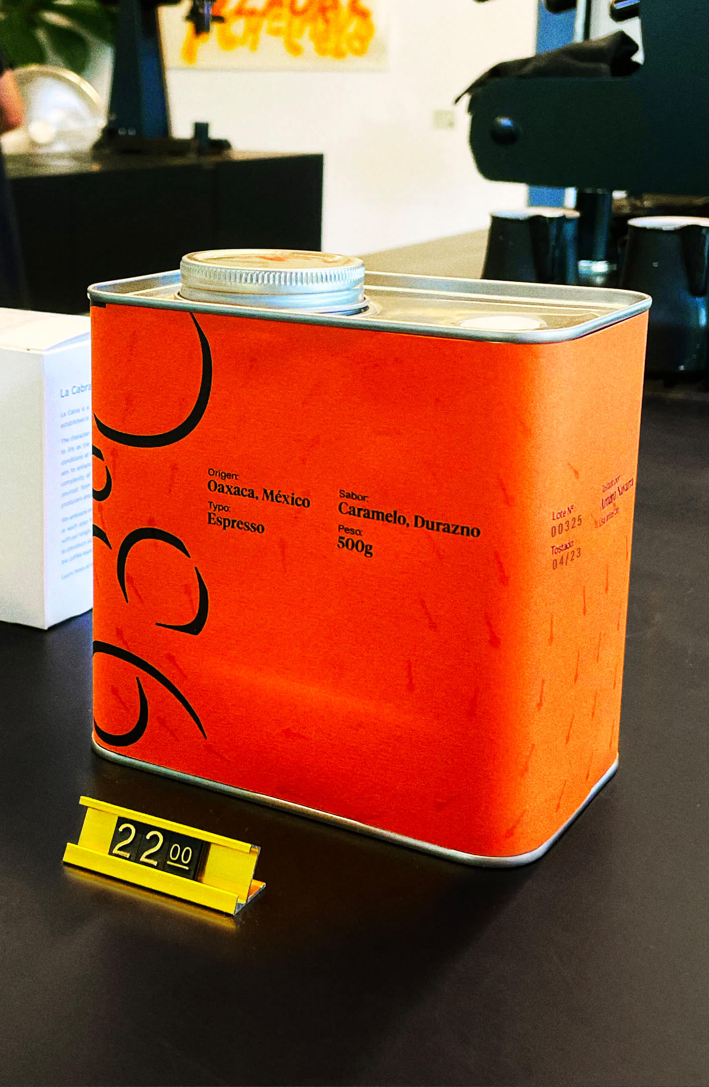
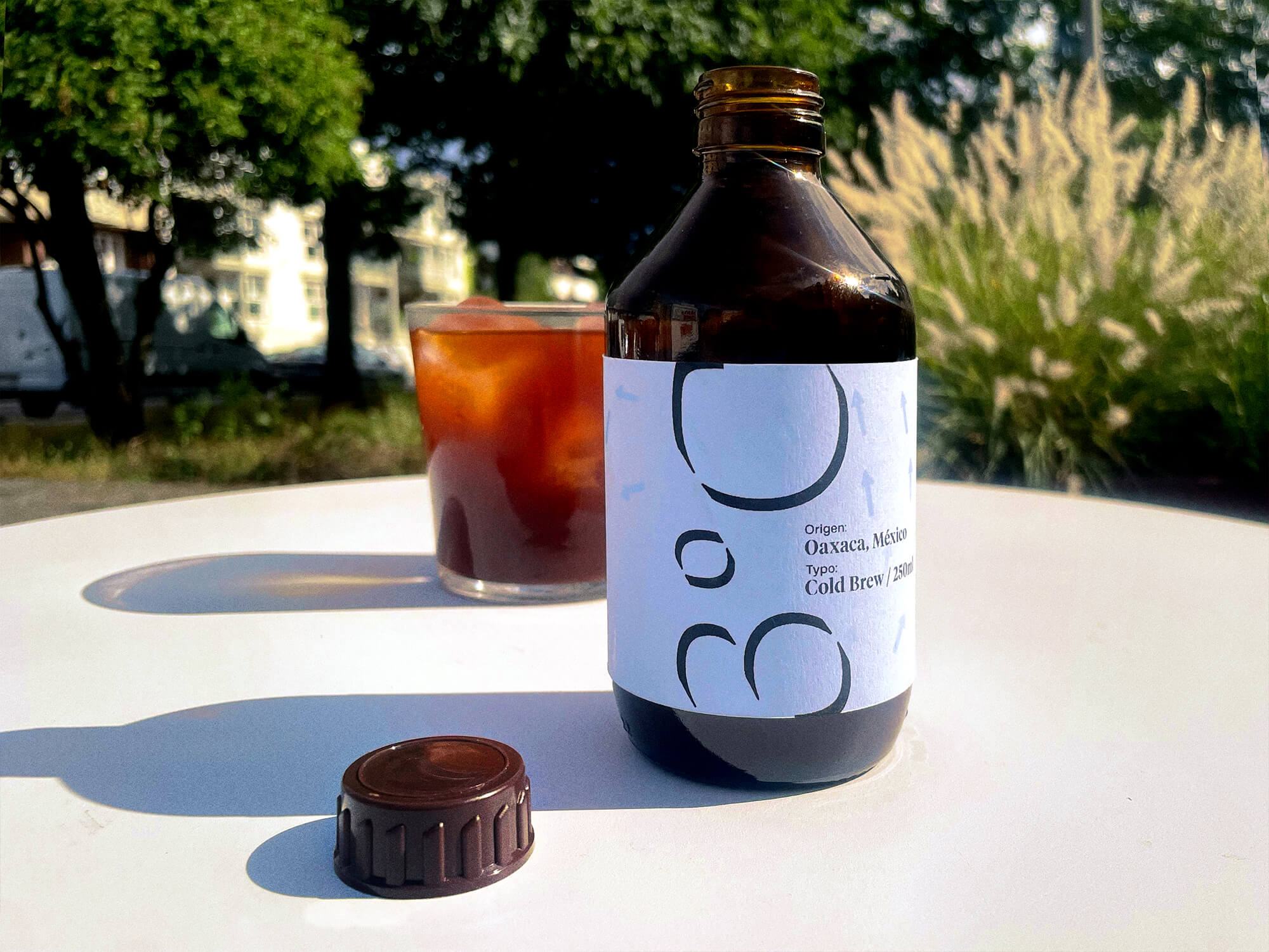
I used strong, contemporary typography that complemented the simple visual elements of the arrows. Ensuring consistency between the packaging for the beans and the packaging for the cold brew was crucial. By reusing certain design elements and making the most significant change through the paper stock, 93°C became its own distinct mini-brand.
