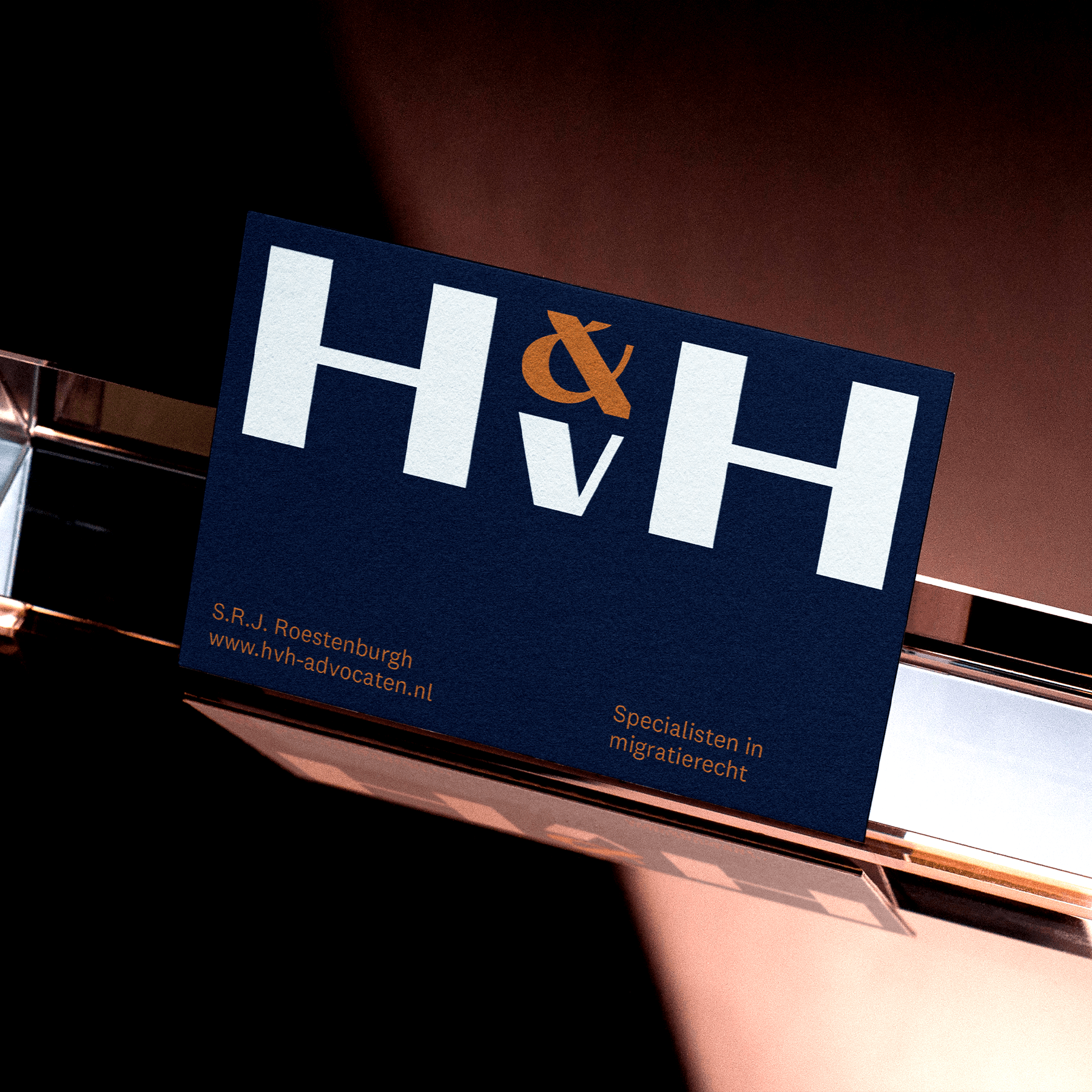
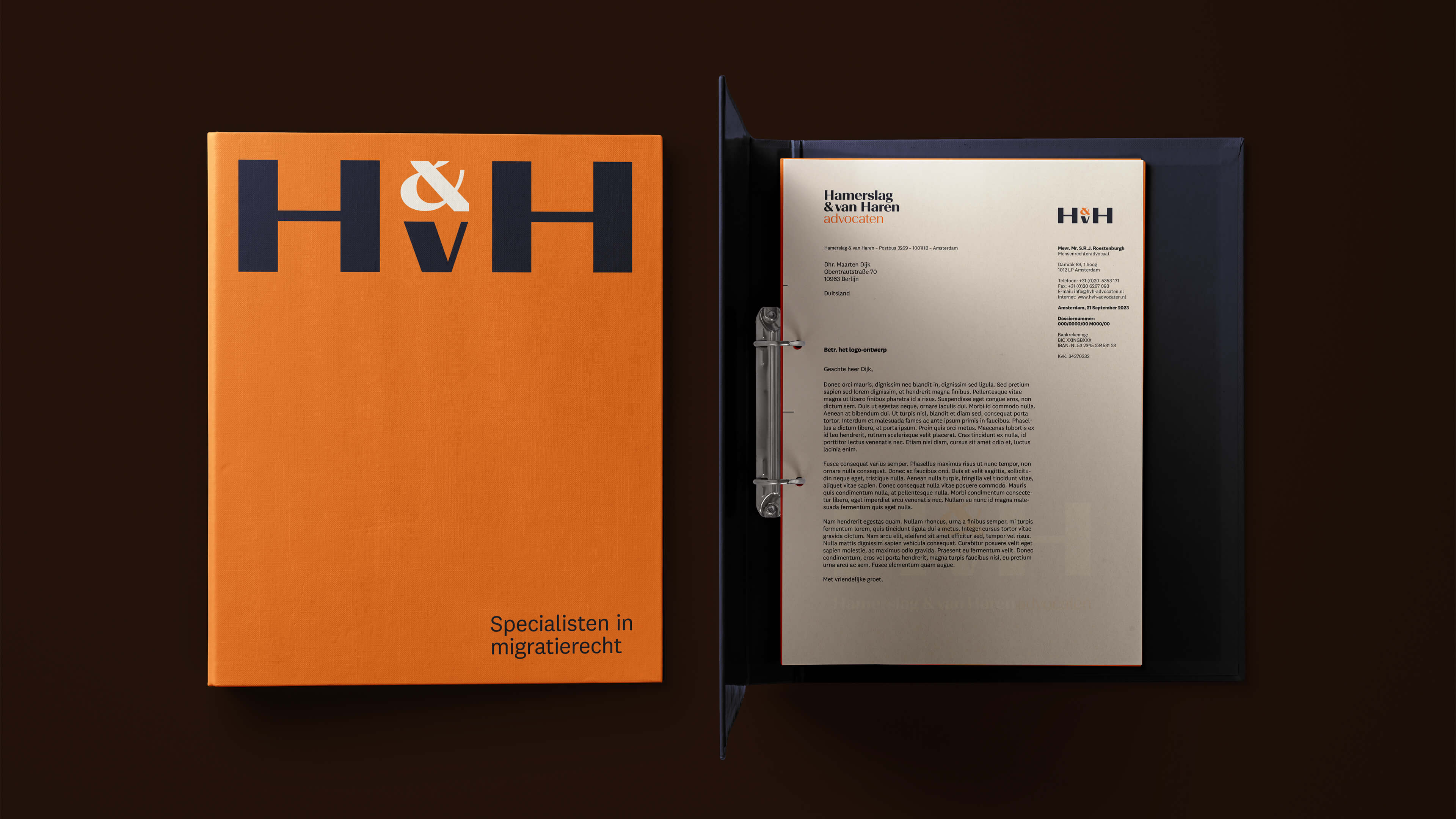
Hamerslag & van Haren is a law firm based in Amsterdam specializing in asylum law, that strives to do good. Founded by Rob Hamerslag in 1984, they have been at the forefront of the law, won numerous important cases, and the founders have even been knighted. The challenge was to create a branding that aligns with both their reputation and values, and their Amsterdam heritage.
I delved into researching the typographic characteristics of Amsterdam, and ultimately found inspiration in the art deco section of my type book. This design choice imbued the logo
with a nostalgic feel that perfectly aligns with the city's cultural heritage. For the color palette, I used the regal aesthetic associated with the Kingdom of The Netherlands.


The end result is a refreshed and more sophisticated appearance that commands attention and respect. Not only does the new look clearly communicate the brand's message, but it is also designed to be relevant and effective for years to come.